In Plain Light 07.17 – The Numbers Issue
Welcome to this month's newsletter!
In this issue:
You may want to rotate your phone in order to improve your browsing experience on this site.

We live by numbers.
We make decisions based on them. We study ratings, statistics, and trends. We compare prices, count stars, and draw charts — first, then conclusions.
Everything we do in the end gets recorded and produces new numbers. Our votes, our purchases, our search phrases are counted, ranked, and presented to other voters, customers, users to affect their choices.
If our life is just a numbers game, we'd rather learn its rules to get better at it.
Useless knowledge: Statistics and other lies
The saying has been around for over a century, but its authorship is unclear. Mark Twain made it popular in the US, with the citing in Chapters from My Autobiography, published in 1906:
Figures often beguile me, particularly when I have the arranging of them myself; in which case the remark attributed to Disraeli would often apply with justice and force: "There are three kinds of lies: lies, damned lies, and statistics."
There is no evidence that Benjamin Disraeli, the British Prime Minister, ever used the phrase. Its earliest appearance in print happened years after his death, in a letter to the editor of The National Observer.
London, 8 June 1891
Sir,—
It has been wittily remarked that there are three kinds of falsehood:
the first is a 'fib,' the second is a downright lie, and the third and
most aggravated is statistics...
Whatever its origins, we use the phrase to express our distrust of arguments backed by numbers seemingly able to prove anything.
“Facts are stubborn things, but statistics are pliable.”
Mark Twain
This might well be true.
Three's a crowd
A single number is just that, a group of them is statistics.
How this group is put together and interpreted is what counts in the end. But both things combined, the method and the comment, is exactly what makes statistics tell, or lie.
Below is a discussion of issues which make statistics lie.

Just human nature
When we communicate, especially when doing it in person, we care to leave a positive impression of ourselves with our counterparts.
This is human nature, we worry about our reputation.
This is why we try to keep our secrets to ourselves.
From this point of view, telling not the whole truth, not only the truth, or simply lying to the pollsters is understandable. The respondents simply try to look better and protect their secrets.
Besides, they don't fear any consequences of this behaviour, as opposed to what they may face when telling the truth, i.e., revealing their real thoughts, beliefs, and desires.
This is why polls, especially those on sensitive issues, are prone to produce vague or wrong results.
This is also the observation and the drive behind Everybody Lies, a book mentioned further down.
No matter of time
The numbers can come about in many different ways. The most obvious is to collect them over time.
The world around us is constantly changing. Every value persisting in it and measured over time becomes data. This data is the most natural way to build a statistic.
Stock prices, industrial output, family size — everything can be presented in relation to time just because the latter progresses itself, too. However, only a few things really depend on it, that is, their variations can be solely explained by changes in time.
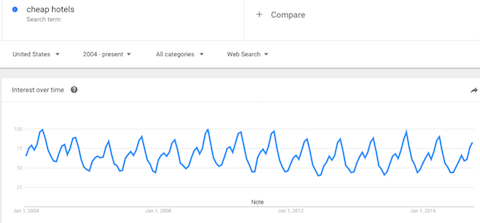
Seasonal numbers are the best example. Tourists on beach holidays in one destination. Christmas cards sold over a year. Or this: Google searches for "cheap hotels" in the US.
 Google searches for "cheap hotels" in the US over time
This is the Google Trends chart of searches for "cheap hotels" over time, from 2004 to early July 2017. Surprisingly – or not, – the pattern repeats every year with a distinct peak in July and another, less significant one in March.
Both events coincide with major holiday periods lying ahead of them — midsummer and spring break.
The lows also return at the same time every year, in November-December. The end of the year celebrations seem to take place among close family, not in some cheap hotels found on the Internet.
Other than that, changes of a measured value over time have other reasons, which may be well worth exploring. While you can plot everything altering with time, there is no causality between the two.
The velocity of a falling rock rises with progressing time, but time doesn't make it grow, nor can it explain the increase — gravitation does, and can.
A wrong scale
When comparing different values, it is essential to present them at the same scale.
Traditionally, wine critics use individual, varying scales for their tasting notes. The ratings can appear in fractions of five stars, 20 or 100 points. Comparing wines based on their grades from different approaches is less helpful.
Even with the common denominator of the highest possible rating, the same note given by two critics can have quite diverse connotations. In order to interpret a rating, you'd better know its author's personal preferences and history of past notes.
With this in mind, assuming that one critic's 18 points out of possible 20 are akin to the other's 90 out of 100 is unfounded.
On the same note – but in a more sober context, – the Central Statistical Administration in the Soviet Union used to compare their annual figures with those of the Russian Empire from 1913, well into the 1980s. I mean, what was that supposed to prove?
A tiny sample
Many doubtful statistical interpretations stem from insufficient data samples.
Flip a coin six times and write down the results. Even with an ideal, unbiased coin, the probability to get both heads and tails three times each is less than one third (this is only the case with 20 out of 64 possible outcomes).
 A single test is not a trend
Screenshot of RANDOM.ORG's Coin Flipper
Concluding a rule from this wouldn't be reasonable.
In a series of three, flipping either all heads or all tails should happen one quarter of the time, in theory. Small samples, or those biased in any way are bound to deliver arbitrary results.
A deceiving average
Another often ignored fallacy derives from the wrong use of average values.
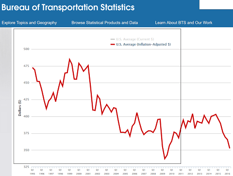
The following chart shows the development of average domestic air travel fares in the US between 1995 and 2016, corrected for inflation:
 Average US air ticket fares, in prices of 2016
The graphic displays a clear downward trend resulting in prices 25% cheaper in the beginning of 2016.
This is actually another pitfall lurking in some statistics. Due to inflation, absolute money values tend to rise with time. Studies of price and stock share movements should adjust for this, otherwise their results are prone to error. Shares going up 7% a year during a period with the inflation rate of 5% won't make you rich.
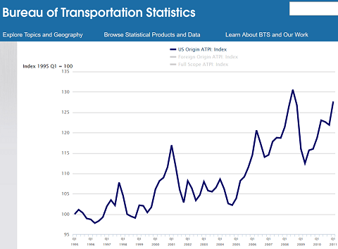
This is not the whole story, though. The bureau provides another statistic based on the same set of data. The air travel price index, computed between 1995 and 2011 (the time period outlined with the frame border in the above chart) looks as follows:
 US Air Travel Price Index, Q1 1995-Q1 2011
Surprisingly, this shows an increase of 28% between Q1 1995 and Q1 2011, whereas the previous chart suggests prices 20% lower at the end of the same interval.
How come?
Well, the average (arithmetic mean) fare takes into account all sold tickets. If the share of cheaper tickets rises significantly over time, the mean can drop, even if all individual prices increase.
For example, consider a network with three airports, A, B, and C, and direct flights scheduled between every two of them. Let's assume that in the first year of operation the tickets between A and B cost $80, those between B and C sold for $60, and travelling between A and C was worth $10.
With 100 flights booked between A and B, 200 between B and C, and 700 between A and C, the average ticket price would amount to (100x80 + 200x60 + 700x10) / 1000 = $27.
Now, suppose the prices climb in the next year and reach $100 for flights between A and B, $80 between B and C, and $20 between A and C. If the number of sold tickets rises as well, say, to 150, 250, and 5,000, respectively, their new average would be down to (150x100 + 250x80 + 5000x20) / 5400 = $25.
This average, now for real, is plotted in the first graphic. The index in the second one, on the other hand, is based on comparing fares for single travel itineraries, that is, between same airports in our example, which apparently increased over time.
Air travellers in the US spend less on a single flight nowadays because they choose to do so, by flying more often on cheaper routes. However, if they were to use the same route, they'd have to pay more for it than in the past.
“I couldn't claim that I was smarter than sixty-five other guys—but the average of sixty-five other guys, certainly!”
Richard Feynman, theoretical physicist, Nobel Prize winner
Apples and oranges
This is the opposite of the tiny sample, in a sense.
In his recent book Everybody Lies, Seth Stephens-Davidowitz, an economist and former Google data analyst, argues that the sheer amount of data available today can create illusion of dependencies and correlations where there are none.
He cites a study conducted by computer scientists from Indiana University and Manchester University trying to predict stock market behaviour based on what people tweeted about their moods several days before.
Sure enough, the study found a correlation between posts about calmness becoming dominant and the Dow Jones Industrial Average rising six days afterwards.
A hedge fund created to gain from the information shut down after a month of lacklustre performance.
To get your own taste of the same feeling, explore probable dependencies with Google Correlate (find the link below). The project looks for queries with similar search frequencies over a given period of time.
Don't get overexcited, though. The ten most correlated searches with "landscape photography" in the United States since 2010 are:
- pointillism
- list examples
- caused
- and how
- paper background
- study
- why and
- aerobic exercise
- axes
- a description
I wonder, what someone looking for "and how" expects to find.

A Word on Statistics
Out of every hundred people,
those who always know better:
fifty-two.
Unsure of every step:
almost all the rest.
Ready to help,
if it doesn't take long:
forty-nine.
Always good,
because they cannot be otherwise:
four — well, maybe five.
Able to admire without envy:
eighteen.
Led to error
by youth (which passes):
sixty, plus or minus.
Those not to be messed with:
four-and-forty.
Living in constant fear
of someone or something:
seventy-seven.
Capable of happiness:
twenty-some-odd at most.
Harmless alone,
turning savage in crowds:
more than half, for sure.
Cruel
when forced by circumstances:
it's better not to know,
not even approximately.
Wise in hindsight:
not many more
than wise in foresight.
Getting nothing out of life except things:
thirty
(though I would like to be wrong).
Balled up in pain
and without a flashlight in the dark:
eighty-three, sooner or later.
Those who are just:
quite a few, thirty-five.
But if it takes effort to understand:
three.
Worthy of empathy:
ninety-nine.
Mortal:
one hundred out of one hundred —
a figure that has never varied yet.
Wisława Szymborska
Published in The Atlantic Monthly, May 1997
“Numbers can be seductive. We can get fixated with them, and in so doing… lose sight for more important considerations.”
Seth Stephens-Davidowitz, Everybody Lies
Just keep it in mind.

Tags: #inplainlight #numbers #statistics
Recommended links
- RANDOM.ORG
- Use randomness from athmospheric noise for your own online experiments in coin flipping, dice rolling, playing cards shuffling, and many more. Generate random numbers, strings, dates, bitmaps, and coordinates, or design your own lottery. Good luck!
- How to Lie with Statistics, by Darrell Huff
- This small book published in 1954 tells the inclined reader how misleading statistics come into being and work to wreak havoc. Read online, or download as PDF.
- Google Trends and Google Correlate
- Two related projects from Google Labs. Trends delivers statistics about the frequency of search queries, and Correlate finds queries with similar frequency patterns.
The first is a glimpse of Big Data and what is possible with mining it. The second can be amusing or annoying, depending on your expectations, but mostly irrelevant, unless you are trying to gain more insight into your own statistics data. - The Atlantic back issues
- Browse the complete online archive of The Atlantic, Magazine of the Year 2016.
Previous issue
- 06.17 – The Photoshop basics issue
- Join me as I scan my images and edit them in Photoshop, and learn some funny facts about the application while at it.
Following issue
- 08.17 – The Game of Thrones and Northern Ireland issue
- Embark on a journey to Game of Thrones filming locations in Northern Ireland, and find out more about both the show and the country.
Unattributed images on this page are sourced from public domain via Pixabay.
Tell me what you think!
Is it useful 👍? Awful 👎? Leave a message! Your comments help make this site better (and give me a kick—one way or another).
Popular articles
-
A kind of magic
If a digital picture has to be seen in the real world, printed on a real medium and displayed in a real showcase, its transition from RAW to real is better done in an old school image editor. Enter A…
-
A duck for a dog
If you got your own place on the Internet, helping your visitors find what they are looking for is a great way to engage them and keep them staying a bit longer. A custom site search can achieve just …
-
"Might as well have the best"
Aiming for better images? Think better lenses! This is your most important piece of gear, so you better get it sorted out. — Need some advice?
 Become a patron for